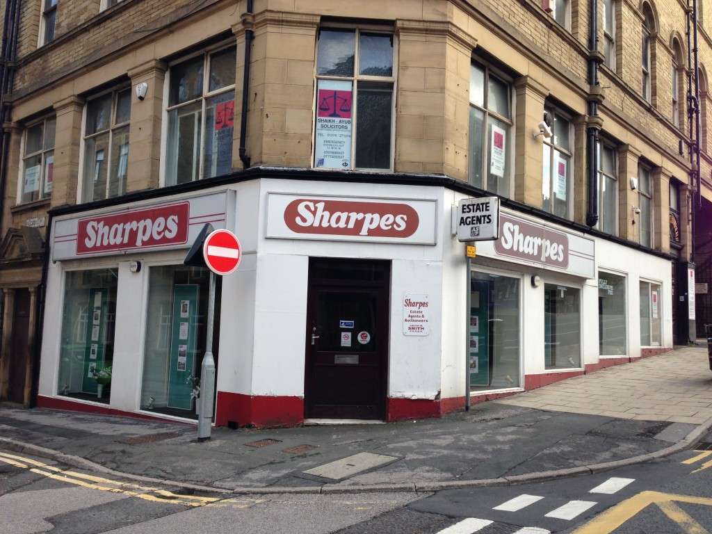
I am impressed that they have used the same font on each facet of the building but set it on different coloured boxes, with different corner ratios, two of which have a background stripe and an outline stroke, and one of which doesn’t.
It’s the attention to detail.